Making FamilySearch feel even more inviting to a younger generation

FamilySearch (self-initiated) · Ongoing

Challenge

  1. Reaching the youth

    Youth are ready, and FamilySearch is already reaching for them. FamilySearch is a free, non-profit family history platform run by The Church of Jesus Christ of Latter-day Saints. Church leaders have invited youth into this work for over a decade, and FamilySearch keeps building for them, with the Together app, quick discovery activities like Compare-a-Face and youth days at RootsTech.

    The main Family Tree experience still speaks mostly to experienced researchers, though. Back in 2018, a FamilySearch designer reported that only 2% of users were under 18, and I wanted to explore what the core app could feel like if it were designed with them in mind.
Action

  1. Epic Meaning and Calling

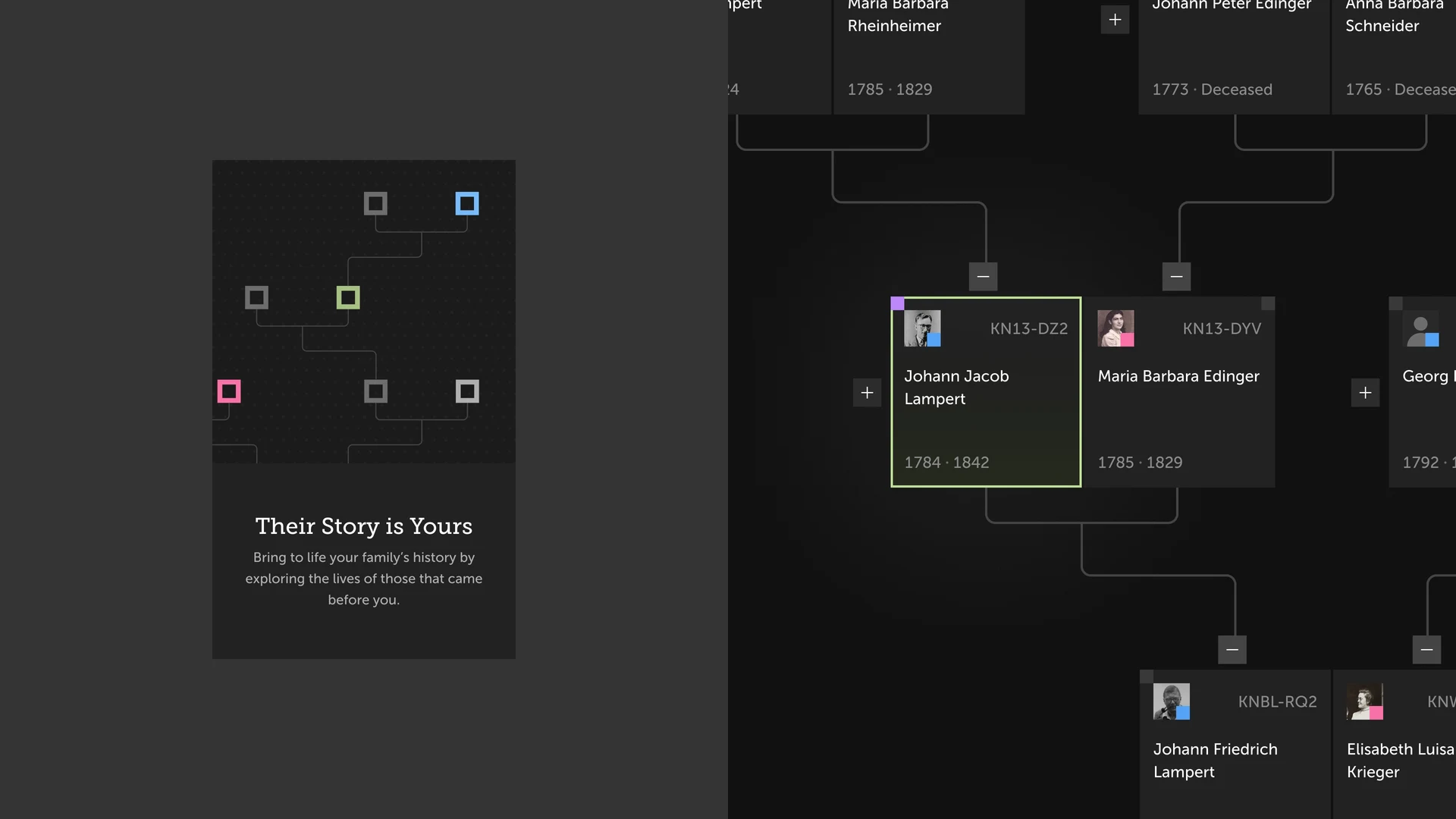
    Find your family. Discover yourself. → Their story is yours

    current

    I wanted young people to see family history as something they could help carry forward. In Yu-kai Chou’s Octalysis framework, Core Drive 1, Epic Meaning and Calling, describes the motivation to contribute to something larger than yourself. That became the lens for the new tagline.1

    I rewrote “Find your family. Discover yourself.” as “Their Story Is Yours.” The idea is to give finding a record or adding a memory a larger purpose: keeping someone’s story alive and connecting it to the generations that follow.

    That invitation had to work for two audiences. For people outside the Church, it speaks to preserving family stories and discovering how those lives connect to their own. For Church members, it also connects to a spiritual calling: finding ancestors and performing temple ordinances on their behalf. The same words make room for both motivations.

  2. Ownership and Social Influence

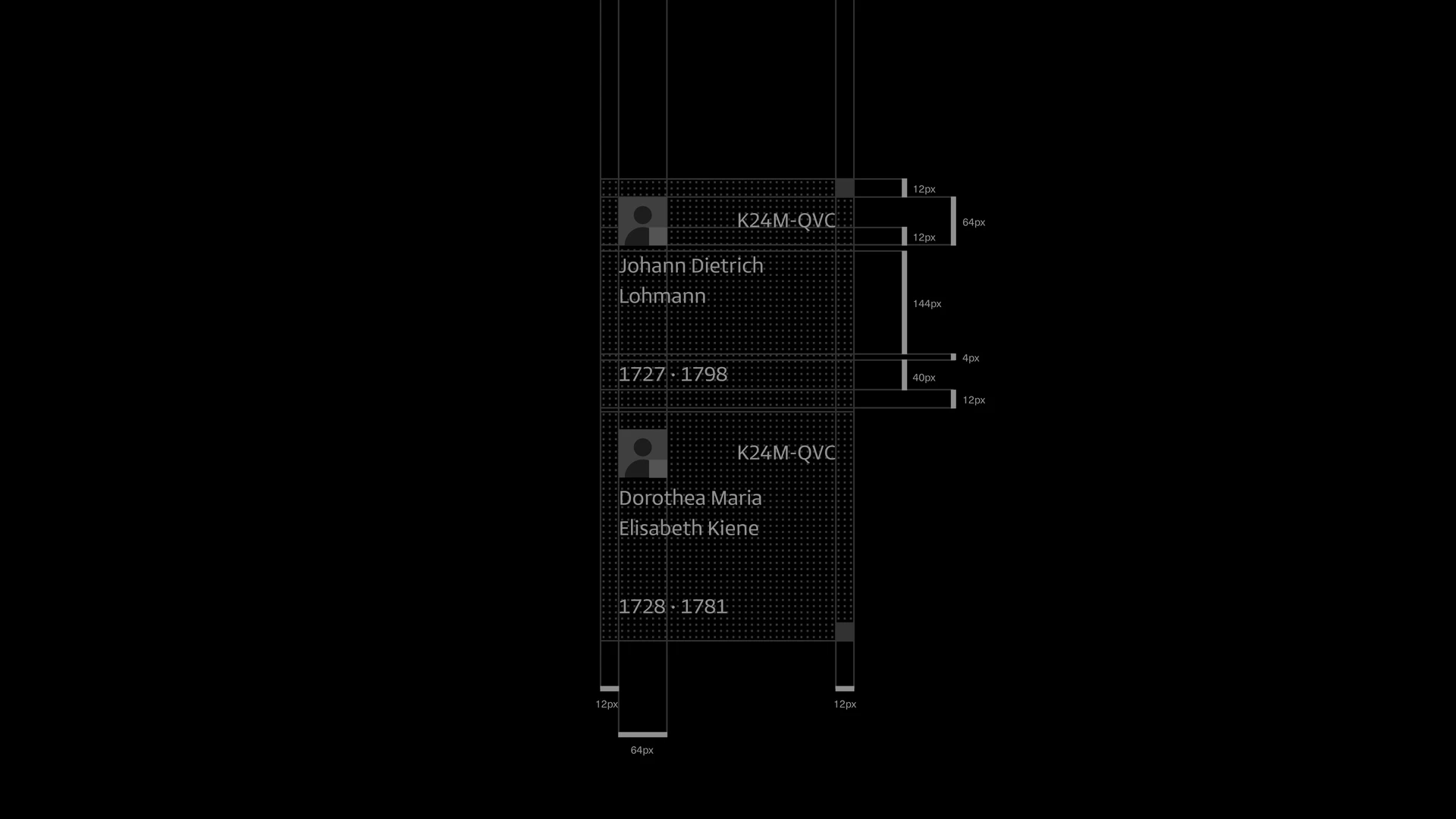
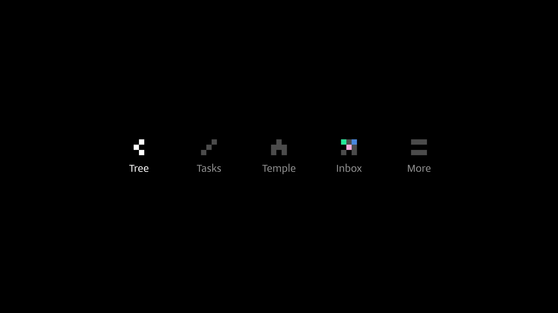
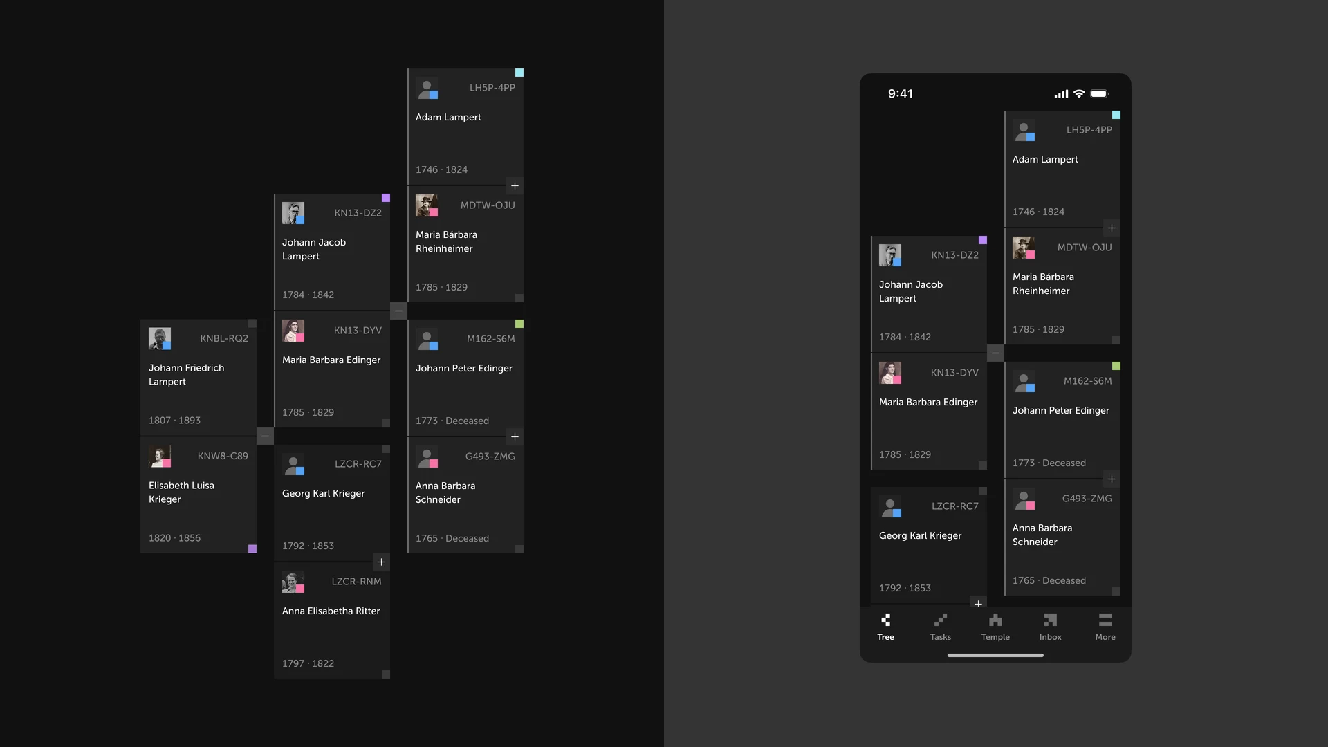
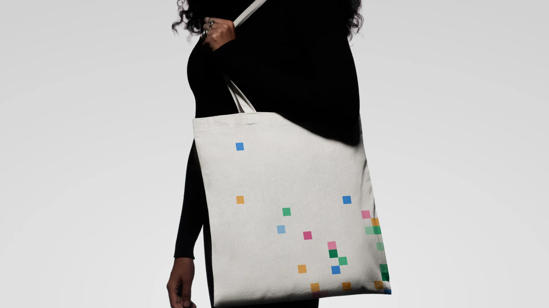
    I used squares to explore a new visual identity and carry that language into the product. The same building block shaped the navigation icons, family cards, and square-based UI.

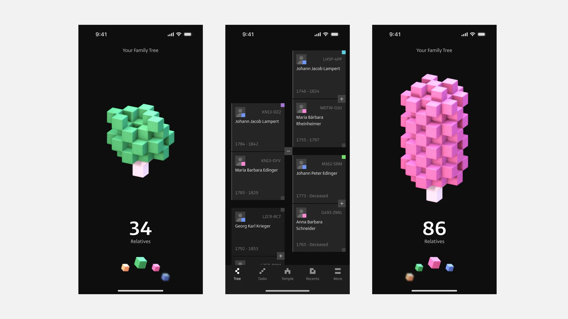
    I also started exploring a dashboard where a 3D tree would reflect the size of each person’s family tree. As they added relatives, they could watch it grow, making their progress visible and giving them something that felt their own.

  3. Changing direction

    The early explorations took me toward a new logo. But the more I considered FamilySearch as a global brand, the clearer it became that the iconic mark was worth keeping. A younger audience didn’t need a different symbol to connect with the product.

    I changed direction: keep the logo and expand its visual language. Its hollow square could become the starting point for cards, connections, navigation, and motion, giving the experience more personality while preserving the recognition the brand already had.

  4. Bringing the hollow square back

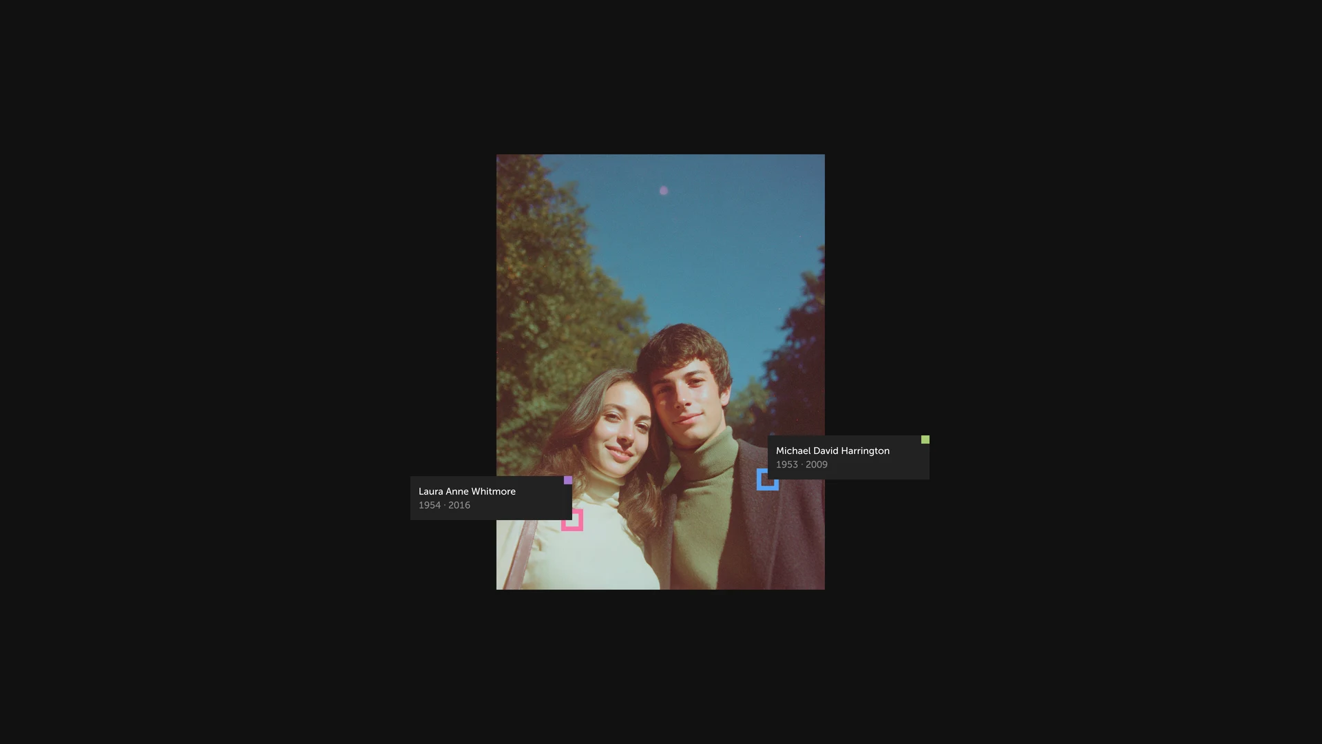
    I returned to the hollow square at the heart of the existing identity and explored how it could carry the family tree into the interface.

    In this exploration, the square becomes a simple way to represent people and their connections. It carries the familiar brand into a more expressive digital experience without changing what people already recognize.

  5. Game-like interactions, on-brand UI

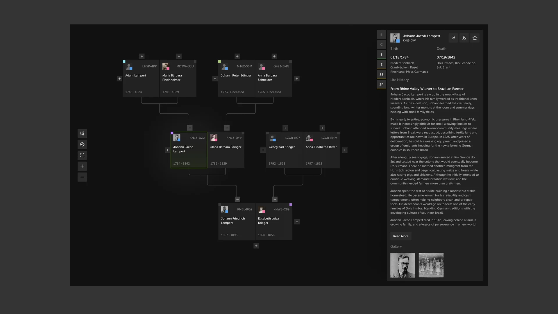
    I carried the hollow square into a working interaction concept. Family cards, connection lines, selection states, and controls share the same visual language, so the experience feels like an extension of FamilySearch rather than a different product.

    Panning, zooming, and selecting a relative make the tree feel like a space to explore. Opening a person’s story keeps the surrounding family connections in view. The game-like quality comes from direct interaction and responsive feedback, while the focus stays on the people behind the records.

  6. A 3D tree that makes progress tangible

    I developed the dashboard idea into Your Family Grove: a 3D tree where each glowing leaf represents a relative. The relative count and the growing tree turn an abstract collection of records into something people can see and explore.

    Through the Octalysis lens, visible growth and milestones support Development and Accomplishment, while a personal grove supports Ownership and Possession. These are the motivations I designed for, not engagement outcomes I have measured.1

    People can orbit the tree, move closer, and discover the relatives represented by its leaves. I also explored a progress bar toward unlocking a temple in the scene. The intention was to make contributions feel visible and the next milestone understandable, without reducing family history to a score.

  7. A family tree you can make your own

    Beyond watching the tree grow, I wanted people to shape how their grove looks and feels. The prototype lets them try different tree appearances, change the time of day, and add rain or snow, seeing each choice reflected immediately in the scene.

    This exploration draws on Octalysis’s Empowerment of Creativity and Feedback: giving people room to try combinations, see the result, and adjust their choices. Customization also supports Ownership and Possession—the grove becomes something they have shaped, not just a visualization they have been given.1

    The aim was to make exploration enjoyable in its own right. The family connections stay the same, but people can give the space a mood and personality of their own.

  8. An ordinances layer, when you need it

    The same tree needs to serve people researching family history and Church members working on temple ordinances. I explored a view option that turns ordinance information on or off without taking people out of the tree.

    With the layer on, ordinance indicators appear on the family cards and reveal details as people explore. With it off, the focus returns to names, relationships, and stories. This keeps a specialized workflow available without making it the default lens for everyone.

  9. A tree that grows with your family

    I tied the size of the 3D tree to the number of people in the family tree. A few relatives form a small tree; hundreds or thousands create a fuller canopy. Each glowing leaf represents a person, so the tree’s scale reflects the family connections behind it.

    The count stays visible, but the changing shape gives that number a physical presence. As people add relatives, they can see their tree grow—not just watch a counter increase. This makes progress easier to recognize while keeping it connected to the people they are discovering.

Result

  1. You don’t need a rebrand to change how a product feels

    The biggest thing I learned is that appeal doesn’t require a new logo. Expanding the existing concept with what young people already use, games and game-like interfaces, did more than a rebrand would have. The brand stayed recognizable, and the product got a lot more inviting for a younger audience.

    FamilySearch is already doing a lot for young people. This concept is my contribution as a member who wants to see that work grow.

Next projectNext project: Lexy
© 2026 Robson Severo